Radheshyam Rollers

A factory website
drawn like an
engineering sheet

Website
Design
Development
2026
The Radheshyam Rollers website on a laptop and a phone over a navy drawing grid: the home page headline, Precision that keeps industry turning, next to its engineering sheet.

The challenge

Radheshyam Rollers is a family factory in Padvala, near Rajkot, that makes taper rollers for the bearing industry. A taper roller is the small cone-shaped part that rolls inside a bearing, the kind that keeps car hubs, tractor axles and gearboxes turning.

The brief came in one line of Gujarati: “મારે એવી વેબસાઈટ જોઈએ છે કે આખા રાજકોટમાં કોઈએ ના બનાવી હોય.” I want a website nobody in all of Rajkot has built. It had to be unique, something the owner would enjoy showing people. Then came the line every client saves for last: “અને હા, ખાસ તો બજેટમાં હોવું જોઈએ.” And yes, above all, it has to fit the budget.

A tilted wall of pages from the Radheshyam Rollers website: home, products, about, infrastructure and contact, all in navy, white and orange.

Unique, on a
small budget

Analysis
and strategy

Unique usually gets bought: 3D models, a photo shoot, an illustrator. The budget had room for none of that. So we set one rule: use free tools that already exist, and put the effort into the idea. The motion runs on GSAP, the smooth scrolling on Lenis and the globe on cobe. There isn’t a single photo on the home page. The only image is the logo, and everything else is drawn in code.

That left the real question: what should a roller company look like? We started with the business, not with other websites. A buyer sends a drawing or a sample, and the factory works to it, down to the micron. In this industry, drawings are the common language. So the website speaks it too.

A home page that
reads like a drawing

Sheet 01, Rev A

The first thing a buyer sees isn’t a photo of a factory. It’s a sheet from an engineering drawing, with a title block, a revision number and real dimensions. One roller is drawn to size, then it moves into place and a whole bearing assembles around it.

The roller is drawn in section, on its centre line.
Hatching marks the cut face of the steel.
Real sizes and the 2° taper, in the one accent colour.
The roller drops into its ring, and ten more complete the bearing.

Rebuilt from the live home page. The figures on the sheet are the factory’s published specs.

A close-up of the engineering sheet on the home page: a taper roller in section with its dimensions in orange, and the size, material and hardness below.

Every product
draws itself

Products

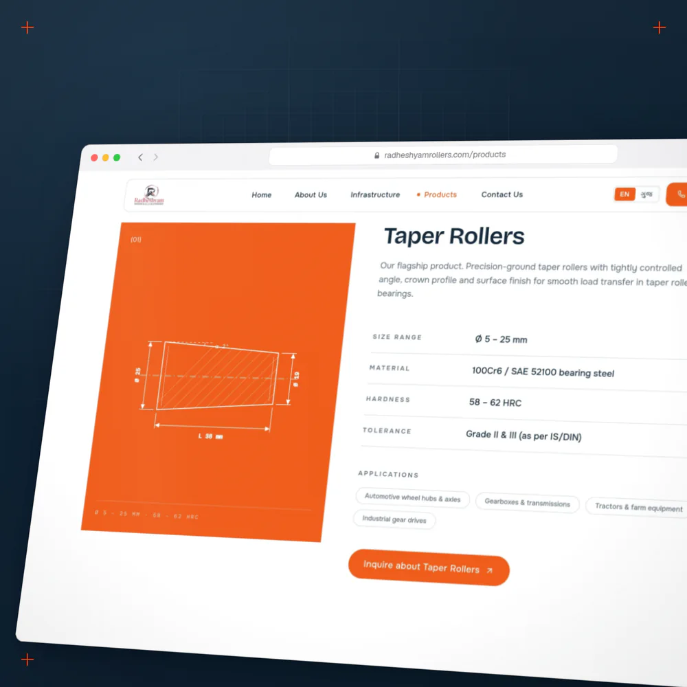
The same idea runs through every page: thin lines, centre marks and small monospaced labels, like the notes on a drawing. On the products page each roller family draws itself, next to the spec table a buyer actually reads: size range, steel grade, hardness, tolerance and where it is used.

Each family ends in its own enquiry button, and every page closes on the same invitation: have a drawing? Send it over.

(01)Ø 25Ø 19L 38 mmα 2°Ø 5 – 25 mm · 58 – 62 HRC
Taper RollersFlagship
Size rangeØ 5 – 25 mm
Material100Cr6 / SAE 52100
Hardness58 – 62 HRC
ToleranceGrade II & III (IS/DIN)
ApplicationsWheel hubs & axlesGearboxesTractors & farm equipment
Inquire about Taper Rollers

Tap a roller to draw it. Specs as published on radheshyamrollers.com/products.

The products page in a browser: the taper roller drawn on an orange panel, beside its spec table and an orange enquiry button.
A spec table a buyer can read at a glance, and an enquiry button for each family
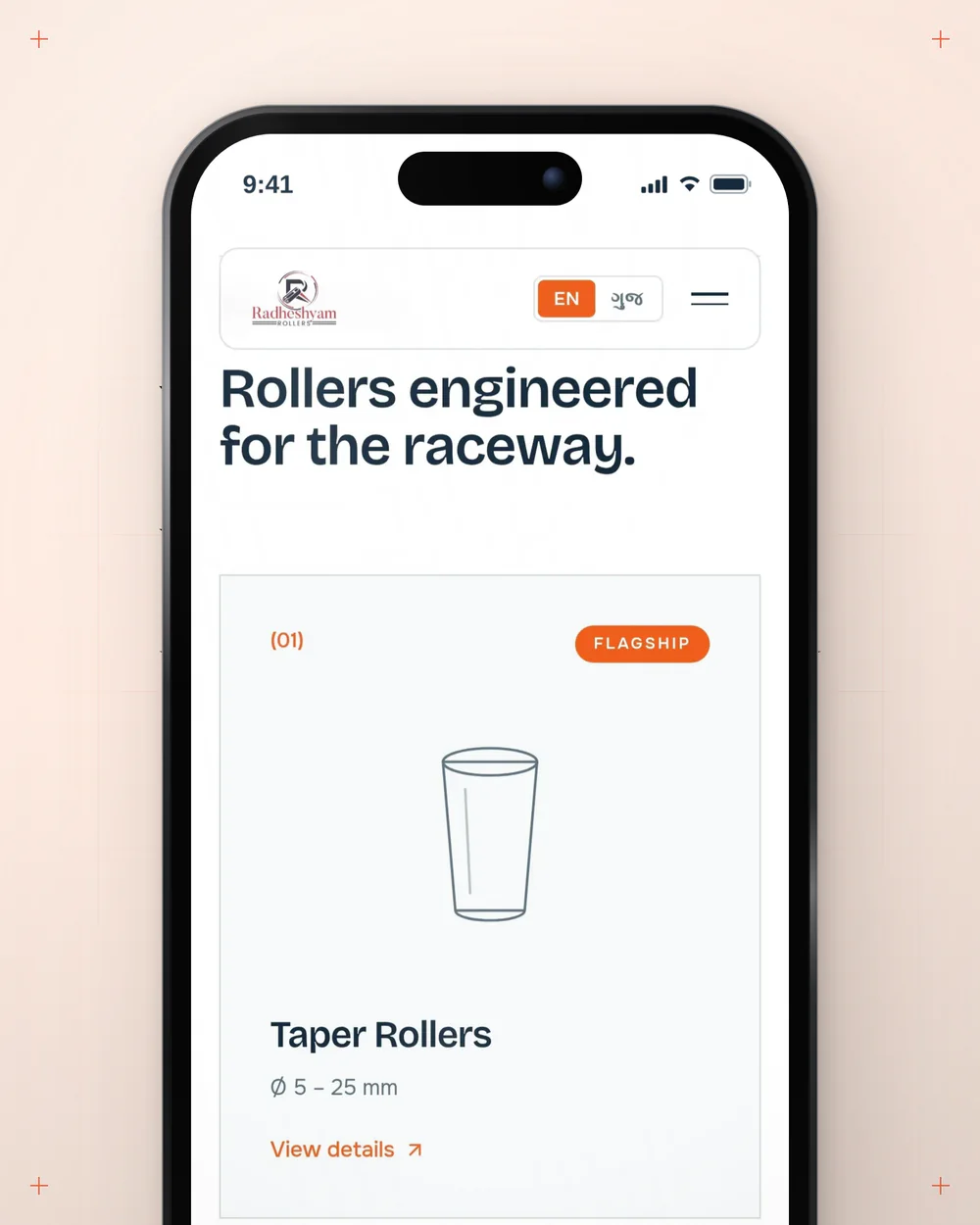
A phone showing the home page product cards: taper, cylindrical and custom rollers, each a small line drawing.
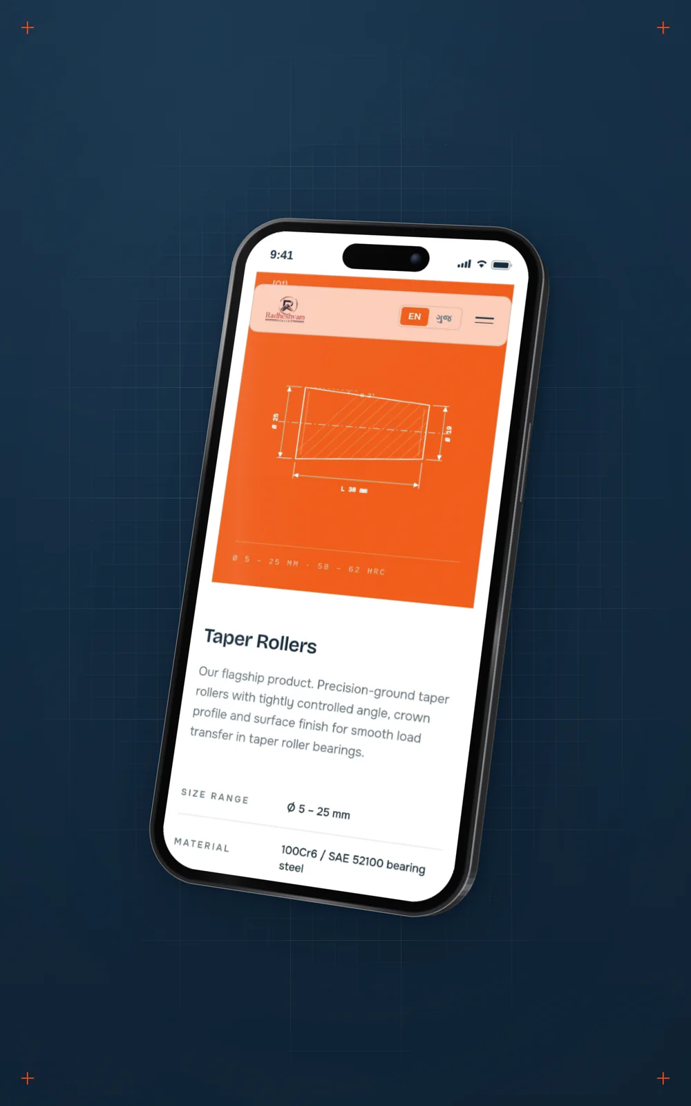
A phone on a navy panel showing the flagship taper roller drawn in white on its orange panel.
The flagship roller gets the page’s one orange panel

Two colours from
the factory floor

Colour and type

The colours came from the same place. Deep navy is the ink of a drawing. Orange is steel in heat treatment, the one stage where the metal itself glows.

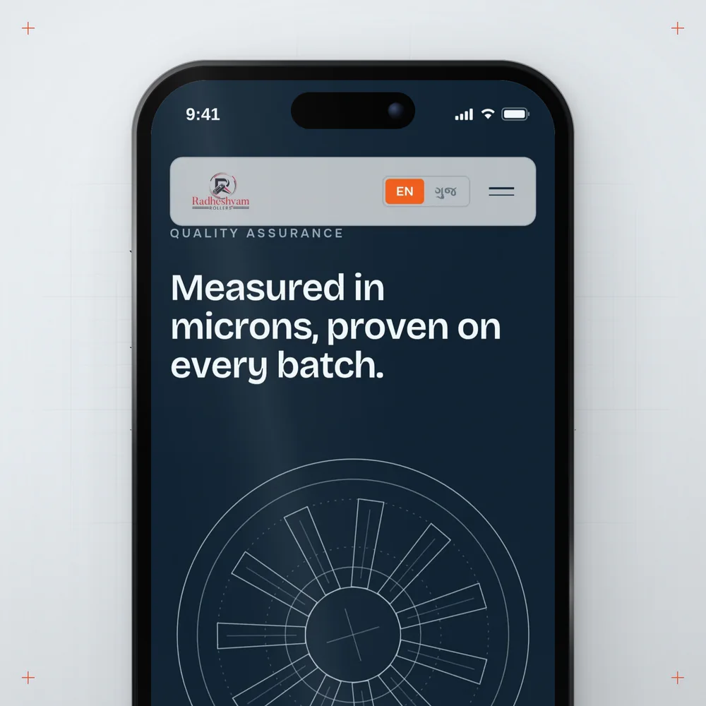
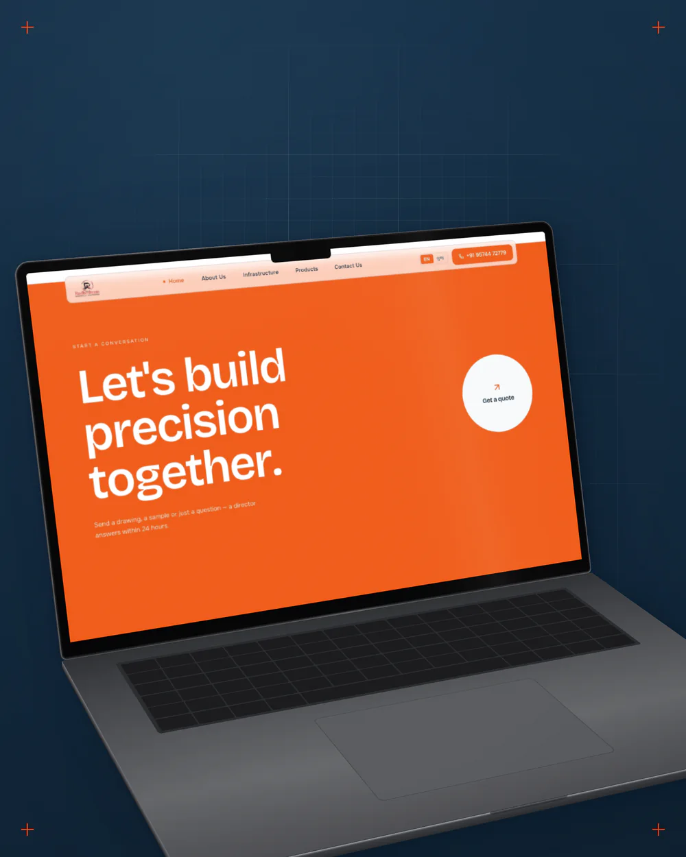
Orange is used sparingly: one word in a headline, a button, an arrow. On the home page only the contact section goes fully orange, so the page warms up right when it asks you to get in touch. Bricolage Grotesque gives the headlines weight and Onest keeps everything else easy to read. One tap switches the whole site to Gujarati, set in Anek Gujarati, because the first people the owner would show it to are right there in Rajkot.

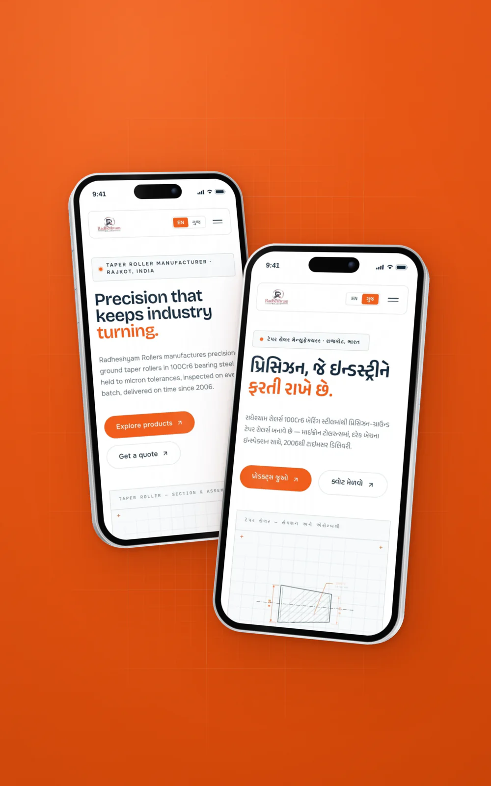
Two phones side by side: the home page in English and the same page in Gujarati.
One tap switches the whole site to Gujarati
A phone showing the navy quality section with its line drawing of a bearing.
Navy, the ink of a drawing
The orange contact section of the home page, Let’s build precision together, on a laptop.
Orange, the glow of heat treatment, saved for the moment the page asks you to get in touch

The logo that
wouldn’t fit

Navigation

One thing we couldn’t redesign was the logo: a red and black seal with a serif name, from a different world than a blueprint. On navy it disappeared. Next to the orange, the red fought back.

So we left the logo alone and changed what sits behind it: a frosted bar that floats above the page and stays pale on every section, so the seal always has the same calm ground.

The frosted navigation bar with the red and black Radheshyam Rollers seal, floating over the navy quality section.

Motion worth
showing off

Motion

The brief’s real test was whether the owner would enjoy showing the site to people. That is where the motion comes in, and every piece of it comes from the factory.

It begins before the page does: the loading screen is a dial gauge, one of the instruments the factory measures with, counting up to 100%. Further down, the quality section has a bearing that turns as you scroll, because the whole company exists to keep things turning. Buttons lean toward the cursor like a magnet, and the export story is a globe with lines running out from Rajkot.

01Loading screen: a dial gauge counts to 100%
02Quality section: the bearing turns as you scroll

Scroll the page and the bearing in the second panel turns with it.

Outcome

What shipped

Radheshyam Rollers now has a five-page website in English and Gujarati: Home, About Us, Infrastructure, Products and Contact Us, each one built from the same drawing language. Buyers can read the full spec of every roller family, and every page ends with the same invitation to send a drawing.

None of it needed a bigger budget. There was no photo shoot, no 3D model and no illustrator. The idea was already inside the factory, in its drawings, its furnace and its gauges. The budget was small. The idea didn’t have to be.

Feedback
from the client

Next project

I want to a.

Tell us where it is today, what you’re trying to achieve and what’s getting in the way.