IID

The first room
a student
walks into

Web design
UI design
Figma
2024
The IID home page design on a laptop: the headline Design Your Dream Career with IID over a line drawing of a room, with gold laurels around the award line.

The challenge

IID is an interior design institute, and we designed its home page. Everyone who opens an interior design school’s website wants to learn how a room should feel. So the home page is the first room they walk into, and it has to feel like a good one.

The page had a lot to carry: nine courses, four benefits, career paths, life at the institute, reasons to join, student reviews, FAQs, the director, an enrolment form and students’ work. It became one Figma frame, 1,280 pixels wide and 10,434 tall. That is about twelve laptop screens.

This is a design case study. The page was designed in Figma and has not launched as a live site, so there is no link to visit and no launch numbers to report.

A tilted wall of sections from the IID design: the hero, Our Program, the benefits, Why IID, the reviews, the FAQ and the enrolment form.

Analysis
and strategy

Twelve screens
of things to say

Give ten sections the same treatment and you get a wall, and nobody reads a wall. So the hard part was never filling the page. It was pace: each section had to feel like a new room, while the whole scroll still felt like one building.

We set that pace with four tools and kept each of them small: two typefaces, one blue with two touches of gold, a plain grid under lines borrowed from the drawing board, and a short kit of parts that keeps coming back.

The whole IID home page cut into twelve laptop-sized screens in reading order, from the hero to the footer, under the Figma frame name MacBook Air - 14.

Two voices,
one job each

Plus Jakarta Sans does the announcing. Every section heading is set in it, bold and large, with the letters pulled in tight. The hero is tracked at −5%, which makes a heading read as one solid shape instead of a row of letters.

Inter does the reading: the menu, every paragraph, the course names and the FAQ questions. Its lowercase stands a little taller against its capitals, which keeps small paragraphs clear. You aren’t meant to notice it, and that is its job.

Tracking −5%
Used forEvery section headingMenu, paragraphs, courses, FAQsIn the fileBold, tracked −5%Regular, no trackingx-height to cap height72%75%
In the file, at real sizesHeroDesign Your DreamJakarta 60SectionCareer OutcomesJakarta 56CourseResidential StudioInter 22ParagraphWe prepare you for the real world of Interior DesignInter 18
The hero’s first word in both faces at one size. The guide lines come from each font’s own measurements. Tap a face to switch.
The IID hero type set large: Design Your Dream Career with IID in Plus Jakarta Sans Bold, beside a spec card listing size 60, tracking −5% and colour #000D44, and the paragraph in Inter 18.

One blue,
two touches of gold

The colour is close to a single idea. One strong blue fills the big sections, the buttons, the icons and the open FAQ row. Headings use a far deeper navy, which reads almost black but stays in the family. Even the pale backgrounds lean blue instead of grey.

On a page this long, colour also keeps time. White gives you room. A pale tint marks a quiet change. Every few screens a full band of blue arrives, and you know you have reached somewhere new. Blue never touches blue.

The whole IID home page design, zoomed out to one long strip.
The real page beside its colour bands, to scale. Hover or tap a row to find it on the page.

The rarest colour
on the page

About a quarter of the page is blue. About 0.02% of it is gold, and gold appears in exactly two places: the laurels around the award line at the top, and the same laurels beside the enrolment form.

So the only warm colour on the page sits next to the two moments that matter most: the first impression and the ask.

The IID palette as paint chips: brand blue #0D2486 at 24% of the page, deep navy #000D44 for headings, and gold #FFCC24 at 0.02% with the award line and its gold laurels, above a strip of the pale tints.

Lines from
the drawing board

An interior project starts as a drawing, and the page keeps some of that. The hero sits on a line drawing of a room. Thin dashed lines with small dots run down the sides of sections, like the construction lines on a plan, and the FAQ rows wear the same dashes as their border.

Under those lines the layout stays plain. Nine courses could have been a long list. Instead they sit in three columns of matching cards, 345 by 104 pixels, with 40 pixels between columns and 28 between rows. The eye learns the pattern once and then just reads.

The Our Program section of the IID design with its grid drawn over it: three columns 345 pixels wide, nine cards of 345 by 104, and gaps of 40 and 28.

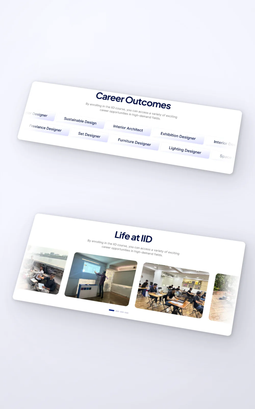
The smaller details follow the same logic. Corners grow with the card: 7 pixels on a course card, 8 on a button, 12 on a benefit tile, 17 on a review and 33 on the big feature cards. Rows of photos, reviews and career pills run off the page and fade out, so you know there is more without a single arrow.

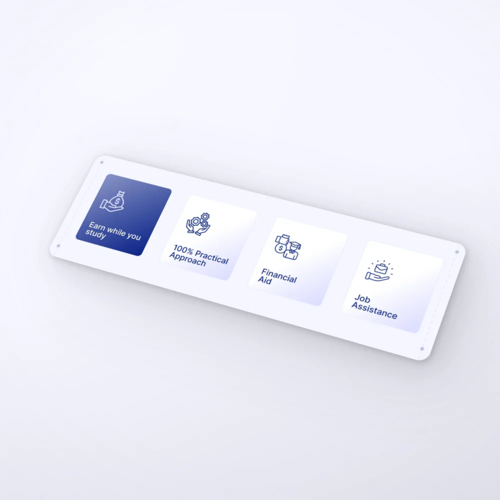
The four benefit tiles from the IID design: Earn while you study, 100% Practical Approach, Financial Aid and Job Assistance. The first is solid blue, the rest are soft white cards.
Four benefit tiles: solid blue for the active one, soft white cards for the rest
The Enroll Now card from the IID design: a photo panel with gold laurels around the award line, beside a short form with a blue Send button. The photo is blurred and the form fields are blank.
The ask: the enrolment form, with the second pair of gold laurels beside it
The Career Outcomes and Life at IID sections from the design: rows of career pills and photos that run off both edges and fade out.
Career pills and Life at IID photos run off the page and fade, so there is clearly more without a single arrow

A small kit
of parts

A long page only feels calm if its parts repeat. This one gets by with very few: a white card with a soft edge, a pale square for each icon, and solid blue for whatever is active.

The FAQ shows how that works. Closed rows stay quiet: white, with the dashed edge. Open one and it fills with the page’s strongest blue. Only one row holds that colour at a time, so the eye goes straight to the answer that was asked for.

FAQsMost frequent questions and answers
The FAQ rebuilt live from the design, in its own words. Tap a question. The file only writes out the last answer, so the others show placeholder lines.
The Why IID section of the design on a desktop monitor: a full band of blue with white outlined feature cards.

Outcome

Delivered
in Figma

The home page was delivered as a Figma design: one frame, 1,280 by 10,434 pixels, from the hero to the footer. It has not launched, so we have no traffic or enquiry numbers to show.

What the file does show is how little a page this long needs. Two typefaces, one blue, two touches of gold and a handful of parts, all there to decide where the eye goes next and when it gets to rest.

A good room is mostly space, well arranged. So is a good page.

Feedback
from the client

Next project

I want to a.

Tell us where it is today, what you’re trying to achieve and what’s getting in the way.